Stillhaus
Back to site

STILLHAUS •    BRAND GUIDELINES

Offline is the new luxury.

One brand, three messages. Everything we design, write and photograph should be traceable back to them, from the hero of the booking site to the note left on the kitchen table.

01/The three messages

Everything we say is one of these three

01The promise

Calm you can walk into

Stillhaus is not a place you have to learn. You open a door and the noise stops. Every touchpoint, a headline, a booking screen, a key in a wooden box, should feel like stepping over that threshold.

We say

  • Arrive and exhale
  • Nothing to set up
  • Quiet, on purpose

We never say

  • Escape the rat race
  • Unplug and unwind™
  • Digital detox retreat
02The craft

Less, but better made

Six cabins, one bed, one table, one very long evening. We remove instead of adding: fewer words, fewer features, better materials. Restraint is the luxury, not abundance.

We say

  • Hand-built, not mass-made
  • One good thing at a time
  • Built to last a decade

We never say

  • Packed with amenities
  • Luxury glamping experience
  • Everything you need and more
03The place

Nature does the talking

The forest, the shoreline and the light are the product. Our design steps back: generous white space, honest photography, no filters that nature didn't already apply.

We say

  • An hour from the city, entirely away from it
  • Sea, forest, silence
  • Let the window be the screen

We never say

  • Breathtaking, stunning, unforgettable
  • Once-in-a-lifetime
  • Paradise found

02/Logotype

Stillhaus
Stillhaus
S.

Wordmark set in Urbanist, uppercase, 0.28em letter-spacing. Never bold, never italic, never condensed. Clear space on all sides equals the cap height. The “S.” monogram is reserved for favicons, stamps and the padlock box.

Downloads · SVG, transparent background

  • Wordmark, charcoal

    Primary use on cream and light surfaces

  • Wordmark, white

    On olive, photography and dark panels

  • Wordmark, olive

    Accent use only, never body sized

  • Monogram, charcoal

    Favicons, stamps, padlock box

  • Monogram, white

    Reversed on olive or charcoal

03/Colour palette

Earth, not ink

Cream

--background

oklch(0.972 0.011 88)

Primary canvas

Charcoal

--foreground

oklch(0.268 0.014 70)

Headlines & body

Olive

--primary

oklch(0.395 0.041 137)

Actions & accents

Sand

--sand

oklch(0.918 0.022 84)

Quiet sections

Moss

--olive

oklch(0.5 0.052 129)

Details, icons

Stone

--muted

oklch(0.936 0.017 87)

Cards & fills

No pure black, no pure white, no saturated accents. Olive carries every call to action; sand and stone separate sections without lines.

04/Typography

Urbanist, one family, five voices

Primary face

Urbanist

A modern geometric sans-serif that balances functional clarity with humanistic warmth. Designed for legibility across digital and physical touchpoints.

Extra LightRegularMediumSemi Bold

Usage example

The forest
is calling.

Book your stay / Stillhaus

Display

Urbanist Light 300 · −3.5% tracking

Calm you can walk into

Section

Urbanist Light 300 · −3% tracking

Explore our off-grid cabins

Card title

Urbanist Regular 400 · −2% tracking

A room of your own, in the woods

Kicker

Urbanist Medium 500 · +22% tracking · uppercase

The experience

Body

Urbanist Regular 400 · 1.7 line height

Bring a book and nothing else. Solo stays include a stocked pantry, a wood stove and the kind of silence that takes a full day to get used to.

05/Design principles

Six rules we don’t break

01

Whitespace is a material

Never fill a section because it looks empty. Space is what makes the photography and the words land.

02

One idea per screen

A section says a single thing. If it needs two headlines, it is two sections.

03

Motion at walking pace

400–900ms, cubic-bezier(0.22, 1, 0.36, 1). Fades and soft rises only, nothing bounces.

04

Photography, unstyled

Natural light, real cabins, no people posing at the camera. Warm grade, never over-saturated.

05

Corners and edges

Radius 0.5rem base, generous 1.5rem on image cards. Hairline borders, soft shadows, no hard black.

06

Language

Short sentences. Concrete nouns. Swedish place names kept as they are. No exclamation marks.

06/Email signature

Two-column, on brand

Monogram block on the left, contact rows on the right. Set in Urbanist, with mono labels for web, mail and tel. The tagline closes it in olive.

New message · preview

S.

Elin Holmberg

Host · Stillhaus

WEBstillhaus.se
MAILhej@stillhaus.se
TEL+46 8 559 000 00

Calm you can walk into.

07/In the world

Stillhaus, off the screen

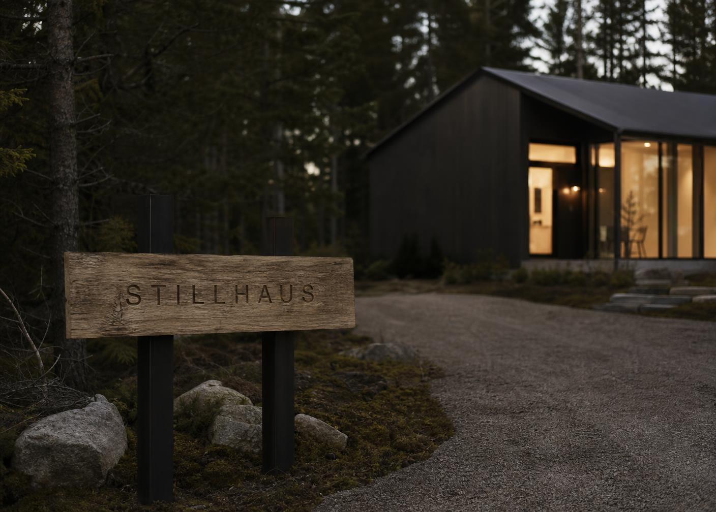
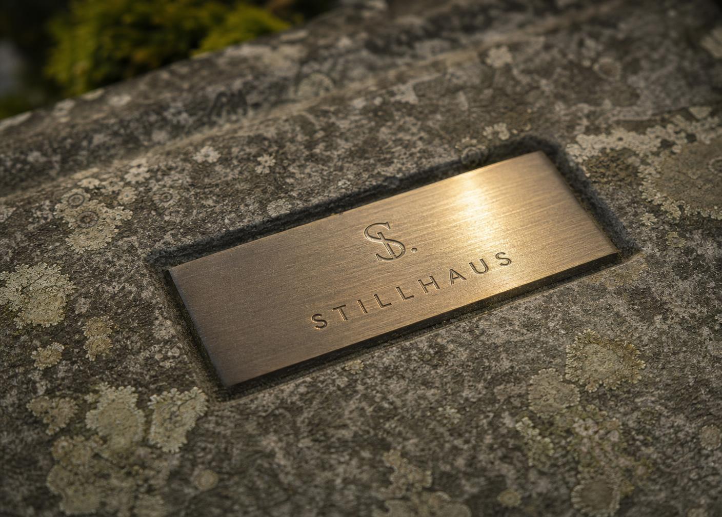
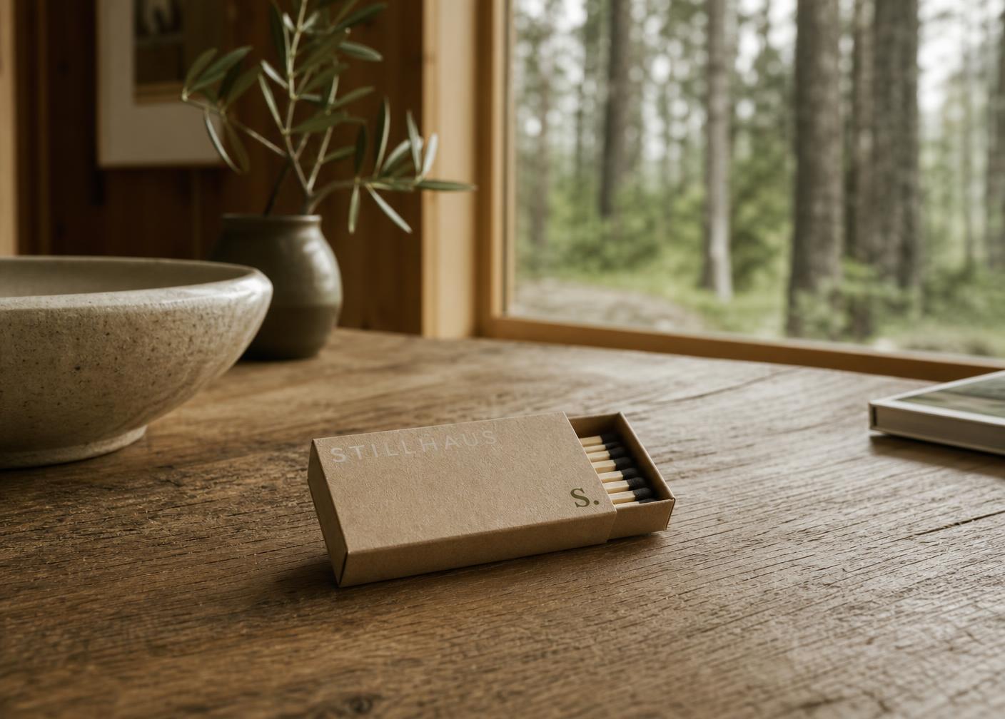
The mark leaves the screen as quietly as it arrives on it: routed in oak, set in brass, printed on kraft. Three materials, one wordmark.

Routed oak sign
01

Entrance marker at each cabin

Routed oak sign

Raw oak board · blackened steel posts

The wordmark is routed into a single oak board and left unfinished, so it weathers with the place. Mounted on blackened steel, the same material as the padlock box.

Engraved brass plate
02

Gate & wayfinding detail

Engraved brass plate

Brushed brass · set into stone

A small brass plate, brushed warm, set flush into stone at the gate. The S. monogram sits above the wordmark. Tactile, low-key, the kind of mark you find at a good hotel.

Kraft matchbox
03

In-cabin object · guest take-home

Kraft matchbox

Uncoated kraft paper · single ink

A matchbox printed in one ink on raw kraft, left on the kitchen table beside the stove. Photogenic, useful, and small enough to travel home in a pocket.

In one line

Stillhaus sells the quiet, not the cabin.

Back to Stillhaus